


Since launch, the new Tuttnauer website has generated 100% increase in leads!
Guy Saban, Online Marketing Manager, Tuttnauer
Tuttnauer, one of the leading global sterilization and infection control companies, has approached us to optimize their online presence, UI/UX, customer journeys, conversions, and marketing content. This has been a comprehensive experience, covering a wide range of solutions from developing a digital strategy plan, visual concept and 3D product modeling, to messaging and content and custom-made website development.
Our group of professionals worked directly with the company’s online marketing team, both in Israel and the US, to solidify their process for understanding customer personas and providing them with an optimal customer journey and experience on Tuttnauer’s websites.
Our main objective was to present Tuttnauer as a trustworthy corporate with an up-to-date online presence. In the new design we opted for a clean layout and a clear structure. A fresh set of colors brings an updated look & feel to the brand, and most importantly complements Tuttnauer’s red logo as well as their new product line 3D production.
We also chose a new tone of voice for the company. One that reflects professionalism and simplicity. Since we targeted diverse audiences from various market segments, we wanted to avoid long and complicated text. Instead, we made an impact by focusing on short and benefit-based text.
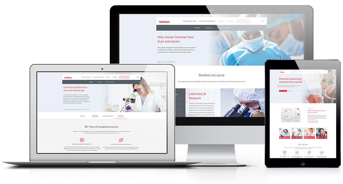
Tuttnauer serves a wide range of markets, from healthcare and research institutes to clinics and laboratories. Decision makers also vary, from architects and planners to autoclave operators, facility managers and service techs.
Planning a good experience for such a diverse array of applications and users was our biggest challenge. That’s because every customer journey is different. Customers are searching for different keywords and phrases, based on specific needs and objectives.
Our approach is that every web page can and should be considered as a landing page, and therefore plays an important role in each customer journey. We then need to engage prospects with the right content – strong visuals and marketing messages based on their needs and expectations – and warm them up to become a lead.
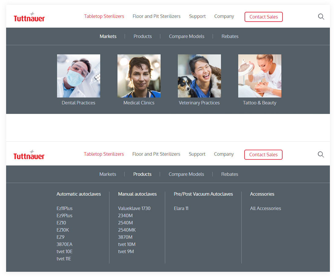
Our main navigation focuses on two sections: Tabletop Sterilizers and Floor & Pit Sterilizers, and two main Calls-to-Action (CTA): ‘Contact Sales’ for Pre-sale users, and ‘Support’ for Post-sale users.
Each of the main sections is divided into Markets and Products. This way, we can meet the needs of customers who are searching for a certain market as well as a specific product. The information in these pages is then displayed according to:
– Important aspects of the product (Sterilization Programs, Data & Software, Technical Specs, etc.)
– Specific needs of decision makers (Autoclave Operation, Service & Maintenance, etc.).
Our goal is to guide all users (pre-sale & post-sale) to their most relevant information – take them on a journey, keep them interested and engaged, and eventually convert them into customers.
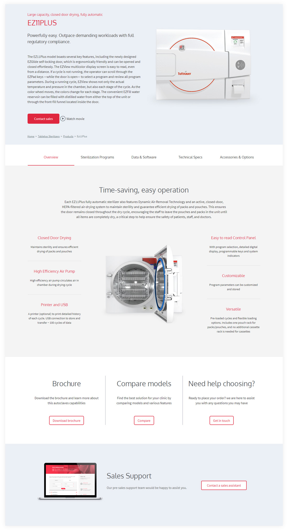
Product pages are usually packed with information. Our approach is to make it simple and clear, helping customers quickly find what they’re looking for without the need to go through long and tiresome text.
In this case, we created a good experience by balancing visuals and benefit-based text that is short and to the point. Also, dividing the flow of information keeps customers engaged:
– The top presents the product with two Calls-to-Action (CTAs): Contact sales, and Watch movie.
– Below, we opted for tabs, so different customers could easily navigate from one subject to another. Each tab is focused on an important aspect of the product: Sterilization Programs, Data & Software, Technical Specs, and Accessories & Options.
– Upon completing their review of the product, customers are presented with three Calls-to-Action (CTAs): download brochure, compare models, or contact sales.
– At the bottom of the page, a banner directs post-sale users (technicians and dealers) to the company’s Service website.
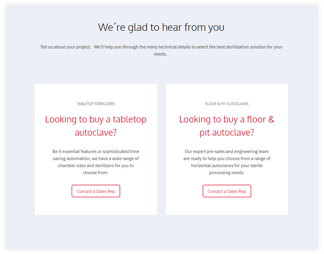
‘Contact Sales’ is one of the most important Call-to-Actions (CTA) on the website. For this section we created two experiences – one for each division:
– Customers who are looking to buy a floor & pit autoclave are presented with a contact form leading to the sales team.
– Customers who are looking to buy a tabletop autoclave can find a sales rep by their zip code – a custom-made feature with contact details for each representative. This way, customers can dial straight from their mobile phones to receive information, quickly and easily.
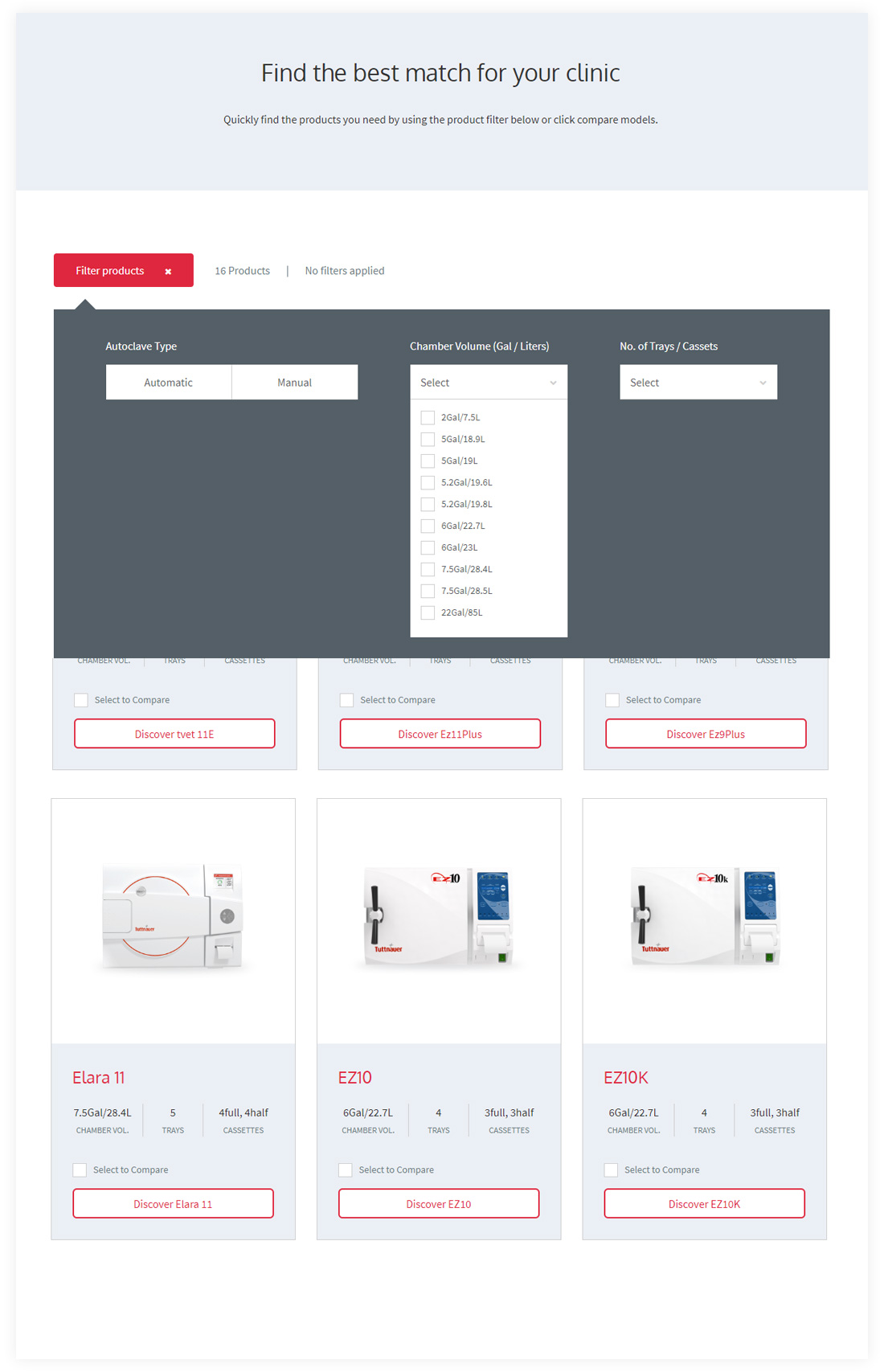
Sometimes, products have similar options, which makes it hard to decide which one to choose. A feature comparison is an easy, helpful way to keep customers on the website by helping them make the right decision.
In this case, we integrated a custom-made ‘Compare Models’ option in the main navigation. This comparison page displays all product models and their main features.
A filter option helps customers choose a product based on their needs and preferences. Such as, Automatic vs. Manual, Chamber Volume, and Number of Trays and Cassettes.
Customers can select up to 5 models, which are visible on a fixed overlay at the bottom of the page. They have the option to remove a product from the comparison and choose a different one instead. When they are ready to continue, they are redirected to a comparison table to finalize their purchase decisions.
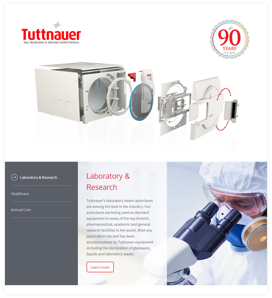
Our stock photography picks for Tuttnauer are guided by the human factor. We wanted to show scenes where a professional is focused on their work. This would help to establish an authentic connection with customers and their various market segments.
Tuttnauer also wanted to take this opportunity to produce 3D models with a consistent look & feel for their entire product line. Our teams worked closely together to produce over 20 autoclave 3D models, featuring a unified frontal view with white, yet subtle, lighting. Zoom-in effects emphasize specific product features, while open doors reveal interior components.
– Digital Strategy Plan (Business / Customer / Marketing)
– Information Design and UI/UX Planning
– Visual Concept and Design
– Custom-Made WP Backend System Development
– Messaging and Content
– 3D Product Modeling
– Project Management